DESIGNING WITH CHARACTER: BEKI BRIGHT ON PATTERN, PERSONALITY, AND BESPOKE POSSIBILITIES
- CLOTH HALL
- Sep 25, 2025
- 6 min read
Updated: Mar 4
In the world of interiors, it’s rare to find a designer whose work feels both artful and accessible. British screen printer and textile designer, Beki Bright manages to strike this balance with ease. Her collections are rich in pattern, steeped in narrative, and infused with the tactile charm of hand-crafted design.

Beki’s fabrics and wallpapers have found their way into homes around the world, from heritage country houses to sleek city apartments, proving their versatility across styles and settings. Whether through bold, expressive prints or more subtle, story-driven motifs, Beki’s work invites interior designers to think beyond the purely decorative and consider the emotion and atmosphere pattern can bring to space.
Cloth Hall recently sat down with Beki to dive into her bold approach to pattern, exploring how designers can effortlessly transform any interior scheme with her striking fabrics and wallpapers. We also discussed the exclusive opportunity to collaborate on bespoke creations, empowering designers to infuse truly unique, personalized elements that elevate ordinary spaces into unforgettable experiences.
Cloth Hall (CH): Your work has a distinctive personality yet feels versatile. Can you share examples of how your designs have been successfully used in both traditional and contemporary interiors?
Beki Bright (BB): The beauty of my designs is their ability to adapt to different spaces. The colours and abstract nature of the patterns allow them to sit comfortably in any interior, whether a period cottage or a contemporary apartment.
For example, my Apple Pickers fabric was recently used as textile walling in a 17th-century English farmhouse, where the subject matter, design, and colour palette beautifully complemented the original beams and antique furniture. At the other end of the spectrum, the same design was chosen for an upholstered headboard in a London apartment. In this setting, it became a striking focal point against white walls and minimal furniture, bringing warmth and character to the space.


Beki Bright's Apple Pickers wallpaper.
CH: Are there elements in your patterns that naturally bridge different design eras?
BB: I love to use unusual colour combinations, experiment with mark-making, and the layering of inks in the screen-printing process. This approach makes each design unique and versatile. Although the inspiration is grounded in historical references, the overall effect is timeless. There’s a familiarity in the subject matter that draws you in, allowing the design to transcend the age or style of a home.
CH: Many of your prints have a strong narrative element. How can interior designers use this storytelling element to create a sense of harmony in a room, especially when layering your patterns with other textiles and finishes?
BB: Because my designs tell a story, they give a room an immediate focal point and mood. Interior designers can use this narrative to tie different elements together. For example, my Plough design is a bucolic landscape; an interior designer might echo this in the finishes by pairing it with natural materials like oak, linen, or handwoven rugs, reinforcing the connection to the countryside.
Another way to create a sense of harmony is to pull out accent colours from the design and use them in plain or textured fabrics, or even in painted woodwork, so the whole space feels considered and cohesive.
CH: Do you find clients respond differently to a design when they know its inspiration?
BB: Absolutely, when clients hear the story behind a design, it often deepens their connection to it. Some designers choose a design specifically because the story resonates with their clients' experiences, while others simply enjoy having that narrative as part of their scheme. It turns the pattern into a conversation piece.

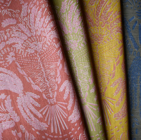


Image 1: Beki Bright's Suffolk Corn textile. Image 2: Suffolk Corn pattern in production.
CH: Your designs often combine bold patterns with a hand-crafted feel. What key considerations would you suggest to interior designers when introducing your fabrics or wallpapers into an existing scheme?
BB: When introducing my designs into an existing scheme, the first step is to think about balance. Because my patterns have a lot of character and the repeats can be quite large, it’s important to give them space to breathe. A good approach is to identify an area that feels like it’s missing texture, colour, or pattern; this could be a kitchen blind, an upholstered chair, or even wallpapering a downstairs cloakroom. I also recommend choosing designs that complement your existing colour palette. This ensures an immediate sense of cohesion and makes it easier to integrate a bold pattern without overwhelming the space.


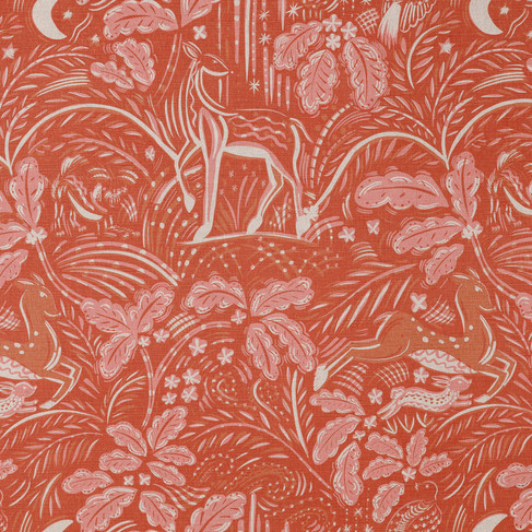
Image 1: Beki Bright's Staffordshire pattern in production. Image 2: Staffordshire textile.
CH: Are there certain room types or design styles where you think bold prints really shine?
BB: I believe that my prints can work anywhere, but they really shine in spaces where you want to create an atmosphere. Although the designs are large in scale, the colours are gentle and are not too vibrant so they don’t over power a room.
Curtains and upholstered furniture in a living space, headboards and wallpaper in a bedroom, wallpaper and blinds in a kitchen, wallpaper and cushions in a nursery… the possbilities are endless.


Beki Bright's The Plough textile on Kit Kemp Melissa Sofas for Firmdale Hotels.
CH: Patterns have the power to shape the mood of a room. How do you guide designers in choosing the right pattern variations (whether in scale, colour, or style) to suit different spaces and functions?
BB: I always find it best to start with the hero pattern and build the scheme around it. For example, you might use our Staffordshire wallpaper in a bedroom, pair it with a mid-scale geometric like Dolly for headboards, and add the small scaled Thatch for cushions and drapes. This way, you can create a full Beki Bright look that feels layered and cohesive without being overpowering.
CH: In your experience, how do patterns interact with architectural features like ceiling height or natural light?
BB: Patterns have a wonderful way of working with a room’s architecture. For instance, wallpapering a ceiling creates real impact, especially in rooms with generous ceiling height. Natural light also plays a huge role, there’s nothing more magical than seeing dappled light move across my designs, adding depth and a touch of romance to the space.


Images 1, 2 and 3: Beki Bright's The Plough textile cushion cover in Guest House No. 124 Brighton guest rooms.
CH: You also create custom designs for clients. How do you partner with interior designers to collaborate on developing fully bespoke fabrics or wallpapers that meet the unique needs of their projects?
BB: Working on custom designs is one of the most rewarding parts of what I do. Through Cloth Hall, I collaborate closely with interior designers to create fabrics or wallpapers tailored to each project. Often, a client will want to incorporate a landscape that’s personal to their client, perhaps reimagining a cherished view in the style of The Plough, or capturing a garden with favourite plants translated into an all-over repeat. I see it very much as a partnership: we share ideas, colours, and inspiration so the finished design feels unique to the space.


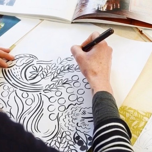
Images 1, and 2: Screen printer and textile designer, Beki Bright creating original artworks.
CH: Can you share a memorable bespoke commission that really pushed your creativity?
BB: I had the absolute pleasure of creating a bespoke collection for a château in the South of France. The house had breathtaking views of the sea and mountains, and my client wanted a landscape print that brought the outside in. We ended up creating two designs: a sweeping landscape and a trailing olive grove. The landscape was used for headboards in every bedroom, each in its own colourway to complement the scheme in each room. The pattern was also applied to lampshades and upholstered armchairs in the library. The olive design became wallpaper for the downstairs bathroom and was also used on lampshades and cushions throughout. I worked closely with the client, visiting the château to draw the landscape and olive trees, gather inspiration, and develop a palette that captured the spirit of the place. It was truly a dream project!
Beki Bright’s work reminds us that pattern is never just surface decoration, it’s a way of telling stories, setting moods, and bringing depth and character into a space. Her fabrics and wallpapers invite interior designers to think beyond aesthetics, offering tools to create rooms that feel layered, personal, and memorable.
Through CLOTH HALL, designers not only have access to her versatile collections but also the rare opportunity to collaborate on bespoke creation. Whether reimagining a beloved landscape, capturing the spirit of a home, or developing a one-of-a-kind pattern that becomes the heartbeat of a project.
For designers seeking to elevate interiors with artistry and meaning, Beki’s work offers both inspiration and partnership, proof that when pattern is chosen with intention, it can truly transform any space.

View the full Beki Bright collection by appointment. Email info@clothhall.ca.


Comments